Blog
Dynamics CRM – Difference of Area [charts]
Microsoft allows you to create different types of charts through the Dynamics CRM interface in order to visualize your data. Charts are a great way to see key performance indicators at a glance, both for your executives and representatives. Dynamics CRM charts can easily be added to dashboards, directly on a Form or List views.
This screenshot shows the current chart types you can choose from within the interface. However, you can easily add many other chart types to your system simply by exporting the chart XML and entering a different chart type currently permitted by MS.
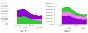
One chart type in particular that I would like to discuss is the Area chart. Below, you can see screenshots of two Area charts. Can you identify the difference? You may think that they are each representing a different data set. However, they actually represent the same data. If you guessed chart type, you are correct. Figure 1 is a traditional Area chart and Figure 2 is a Stacked Area chart.
Traditional Area charts display quantities for each series horizontally, similar to how a line graph or bar chart would appear. If one series quantity is less than another, it will dip behind. While this can be useful to see, it makes it difficult to determine the actual value directly from the chart. As the name implies, Stacked Area charts display your series, stacked vertically. Quantities will never be hidden, but rather the series is stacked as appropriate based on their quantities. The series represents a unified sum that you want to display. If each showed net profit, expenses and cost of goods, the total would represent your sales.
So, which chart type will you use? It may be a matter of preference, depending on your business needs and which type your employees are used to seeing. Luckily, MS Dynamics CRM gives you the ability to choose.
Beringer Associates is always here to provide expert knowledge in topics like these. Please contact us with any questions you may have.


